Much of the work on VerySmallKitchen attempts a territory between language and the visual, expressing that in a mix of concept and idea, drawn and typed and texted, past and future, art and the everyday. It’s as if there might be a kind of writing that makes such simultaneity possible.
One place I recognised such a project, was in the above image – which was Stefan Themerson’s cover image for his book Kurt Schwitters in England: 1940-1948, published by the Themerson’s Gaberbocchus Press. I reproduce it here as a tentative emblem for this kind of writing practice.
As the helpful note on the Themerson Archive quotes from ‘The Connoisseur’:
The first publication of Schwitters’ English poems and prose written during the last 8 years of his life… Themerson’s perceptive text is based on a talk originally given to the Gaberbocchus Common Room. ‘…one of the most lively examples of book design produced in England recently. The book is published in celloglassed paper boards, with a binding design of outrageous ingenuity. The inside is as unorthodox and ingenious as befits its subject and the whole effect is most refreshing.’
Themerson’s insertion into current experimental writing practices occured most recently through Phil Baber’s excellent Cannon journal. Baber was particularly interested in the Themerson’s publication of Barabara Wrights translation of Raymond Queneus’s Exercises in Style. He cites Wright’s own comment on her translation of Queneau’s French text, itself a series of stories telling the same mundane story in a variety of styles:
Queneau told me that the Exercises was one of his books which he would like to be translated – (he didn’t suggest by whom). At one time I thought he was crazy. I thought that the book was an experiment with the French language as such, and therefore as untranslatable as the small of garlic in the Paris metro. But I was wrong. In the same way as the story as such doesn’t matter, the particular language it is written in doesn’t matter as such. Perhaps the book is an exercise in communication patterns, whatever their linguistic sounds. And it seems to me that Queneau’s attitude of enquiry and examination can, and perhaps should? – be applied to every language, and that is what I have tried to achieve with the English version.
The cover for this book is below, with quote and book design both unfolding a writing and thinking that is moving, translating, breaking, superimposing and scrawling between languages and styles:
Something of this practice of language is also expressed by Dorothea Von Hantelmann in How to Do Things with Art, an excellent series of essays on James Coleman, Daniel Buren, Jeff Koons and Tino Seghal. What von Hantelmann outlines as one of the starting points of her book, is also true of the writing practice these Gaberbocchus covers make a possibility:
Singular expressive acts that completely withdraw from discourse are not only irrelevant; they are not even thinkable. The idea of efficacy produced by a rupture from conventions is replaced by the use of conventions – a use that also contains a transforming potential. With this notion of performativity we can, for example, concretize how every art work, not in spite of but by virtue of its integration in certain conventions, “acts”: how, for example, via the museum it sustains or co-produces a certain notion of history, progress and development.
The model of performativity points toward these fundamental levels of meaning production. It puts the conventions of arts production, presentation and historical persistence into focus, shows how these conventions are co-produced by any artwork – independent of its respective content – and argues that it is precisely this dependency on conventions that opens up the possibility of changing them. (19-20)

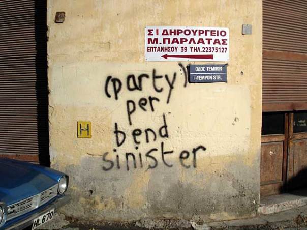
Blazon for Manifesta 6 School Badge, 2005, Corner of Pentadaktilou and Tempon Streets, Nicosia, Cyprus.
For more information on the possibilities of emblems, meanwhile, see Dexter Sinister’s recent Portable Document Format – itself on boundaries of print and web, monograph and catalogue and primer, artists book and library copy – in which they propose an emblem for a (possibly) temporary art school:
Heraldry is a graphic language evolved from around 1130AD to identify families, states, and other social groups. Specific visual forms yield specific meanings, and these forms may be combined in an intricate syntax of meaning and representation. Any heraldic device is described by both a written description and its corresponding graphic form. The set of a priori written instructions is called a blazon – to give it form is to emblazon.
… The badge we would like to wear is two-faced – both founded on ,and breaking from, established guidelines. Stripped to its fundamentals, and described in heraldic vocabulary, it is uncharged. It is a schizophrenic frame, a paradox, a forward slash making a temporary alliance between categories, simultaneously generic and/or specific.

