Alongside his joint show with Shandra Lamaute, Gerry Smith is at the Totalkunst Gallery today for a conversation on reductive forms and mundane literalism, both terms he has coined for a practice whose website declares “iamatextbasedartist.com.” Following the talk Gerry will lead a Haikuisation workshop. Bring a book of short stories if you come to that one, or grab one from the bookcase in The Forest Cafe just outside.
I first came across Gerry’s work in 2010 through books such as ESSENTIAL READING and I am a text based artist; Selected Words 1998-2008, and through The Universal History III, which Gerry contributed a selection of as a VSK Project. I enjoyed both the humor and detail of such work, its sense and mix of structure and story. It helped, too, with thinking through the legacy of, say, Ian Hamilton Finlay and Yoko Ono’s minimal text forms, how contemporary forms of that work could be found through subtle changes of mood, tone and context.
It was Gerry’s insistence that he was NOT a poet – and his text work was not poems – that partly led to this exhibition’s title (along with the historical repetitions of such notions by, for example, Lawrence Weiner). Given Gerry’s texts could be fitted into a history of the minimalist poem I was interested in the space that was brought into being by that NOT A.
Also – I’m trying to articulate this more fully as I AM NOT A POET unfolds – what relationships are there between Smith and, for example, another I AM NOT A POET exhibitor nick-e melville’s recently published STUFF (reviewed by Tom Jenks at 3AM here). Nick-e’s work is more usually framed within contexts of visual and experimental poetry, but both evidence a shared history and contemporary form of/for conceptual, concrete and fluxus writings.

Perhaps it’s a way of talking, with talking seen as intrinsic to writing and art practice (and also central to Colin Herd’s NOW THAT’S WHAT I CALL, next up in the space). Gerry describes the works appearing in the gallery this week as follows:
Whilst Walking Past A Tall Building is a process piece in five articles and eight letters. I began the process by submitting a question to The Guardian’s Notes & Queries, and the piece consists of the answers that were published. Only structural edits were made, with no alteration to the contents. Hayley Jones, Graham Simpson, and Emily Streete provided the readings.
Breathe consists of three punctuation poems constructed from breves. The texts used are taken from Allan Kaprow’s Performing Life.
12 Haikuisations. These reductive works demonstrate the simple writing strategy of haikuisation. These texts are based upon works by the following authors:Nicolas Evans, Johann Wolfgang Von Goethe, Samantha Harvey. William Heiensen, M.R.James, A. L. Kennedy, Heinrich Von Kliest,Robert Maugham, William McIlvanney, Georges Simenon (twice) and Emma Smith.
*
The images in this post document a number of recent projects. As Gerry writes:
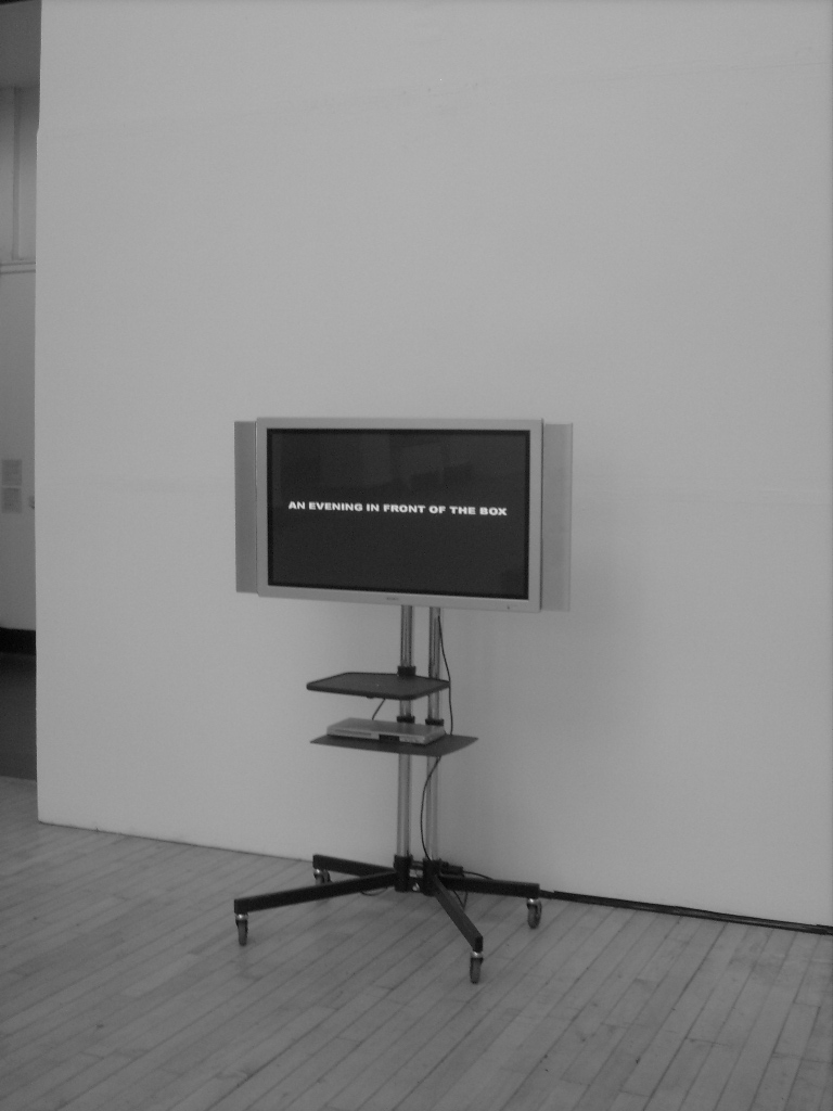
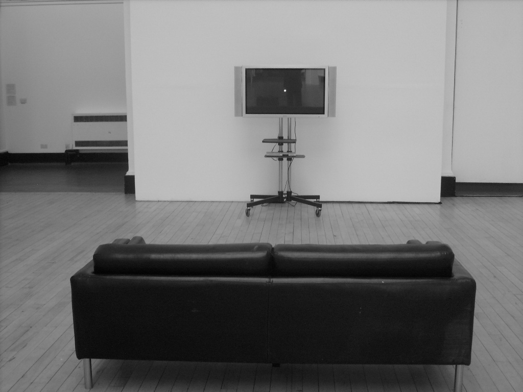
… There are also photos of An Evening In Front Of The Box (2011) from the recent DOCument show (this piece brings together an instruction piece with a
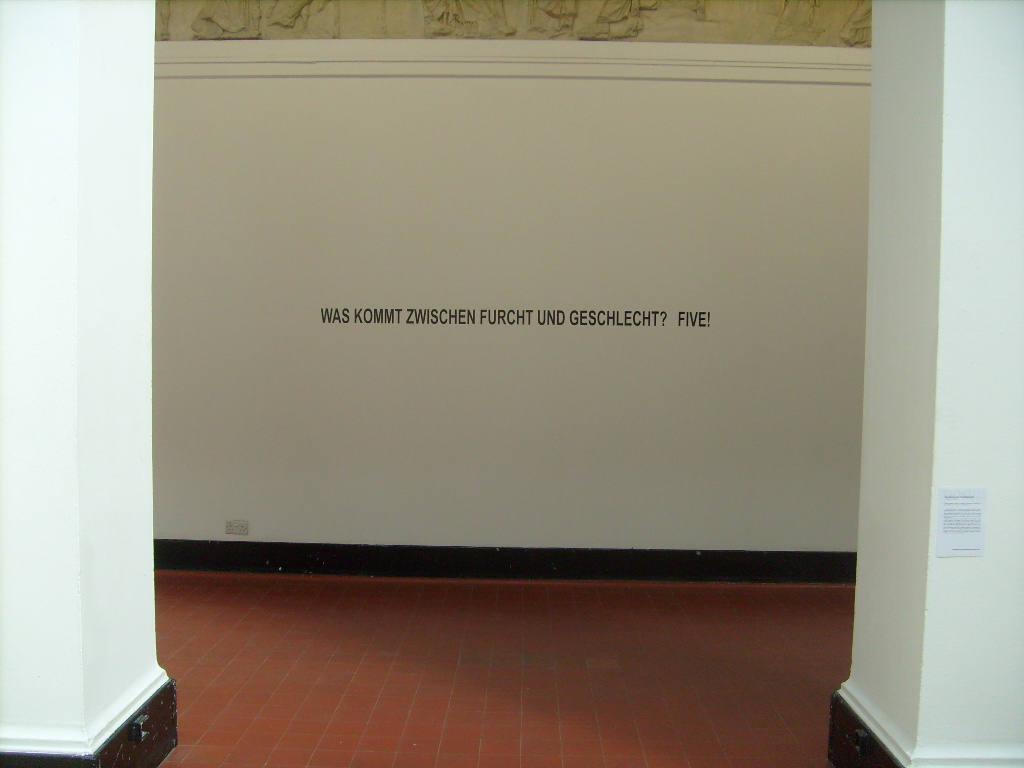
punctuation poem (i.e. the white dot on the screen). The black and white photos give it a suitably retro feel. The final piece, also from DOCument, is Lost in
Translation: when re-translated – at least through Babelfish! – you end up with: What comes between fear and sex? Funf !
… I really like the last piece as it fails to work on so many levels…
Finally, I include below the gallery information notice Gerry has provided for the piece currently on show (until 10PM August 13th) in I AM NOT POET. As Gerry observes, it is part of the work. I include it here, without the work, as an encouragement to come along, but also to give it a life of its own (not in the correct font), evidence of the particular attentions and tones informing his practice:
A gallery information label is hung alongside Two Poems in Response to François Le Lionnais. This label is part of the work, and contains the following text:
Two Poems in Response to François Le Lionnais
François Le Lionnais was a Dadaist poet and founder member of OULIPO (abbr. Fr. The Workshop for Potential Literature). In his article “Exercices de littérature potentielle” (1961), he proposed the creation of a reductive poetry, where each poem would consist of a single letter (he admitted that such a poetry “may lie on the far side of the acceptable limit”). Le Lionnais created the first of these poems, T, and left it for the rest of his colleagues in the OULIPO to complete the set of 26 Roman letters.
The Yogh (З) is a Middle Scots / Middle English letter; it is the “forgotten” 27th letter of the Scots alphabet. The yogh resembles a tailed “z” or the Arabic numeral “3”, and it’s one of those letters that tends to have a weird effect on those around it (which is why “Menzies” is pronounced ming-is or ming-iz, depending on your accent). Its most illustrious time was really in the glory days of handwriting, and its use went into sharp decline with the onset of print (there were typesets available which included the yogh, but printers tended to substitute for it the Manx cat of the letter “z”). Whilst the use of it had seriously declined by the 17th century, its cause wasn’t really helped by the Scottish intelligentsia’s headlong rush to adopt what they saw as the more “cultured” form of the new Standard English. Economic factors had nothing to do with this whatsoever.
The Scharfes s ( ß ) is a ligature of the “long s” and “s” or “z”. In the German alphabet the “sharp s” became a letter in its own right. It is also known as the “Eszett”. The letter has no upper case and, as a result, has never got above its station – and all the better for it! In the last few decades, reforms of the German language have sought to restrict the use of the Scharfes s. Furthermore, there have recently been calls from bureaucrats within the E.U. for the letter to be abandoned, as this would make easier the standardisation of computer keyboards in governmental departments across Europe. Economic factors have nothing to do with this whatsoever.
The Perspex label holder is the sort used by the National Galleries of Scotland. Likewise, the font used for the text.
*
More about Gerry Smith’s work is here.
